Concept and creative process
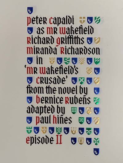
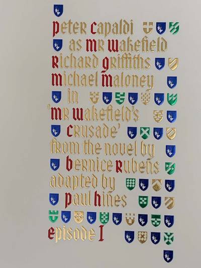
The elegant typographic solution to the title sequence for 'Mr Wakefield's Crusade', a darkly comic murder mystery, was created by Alan Jeapes, a designer who loved type and always took meticulous personal care over the letter and word spacing of his work. In this opening title sequence, he achieved an apparently deceptively simple result. It looks like a beautifully executed foil-blocked roller caption, printed in gold foil with red initial letters and green and blue decorative details. In fact, it required two separate captions to achieve the subtle changes from black to gold that occur during the tracking and panning movement of the camera. These two captions, foil-blocked on cream hand-made paper, were registered precisely with one another and shot separately using the same tracking and panning speed data on a computer-controlled video rostrum camera. In post-production the two versions of the roller caption artwork were combined using a soft-edged matte to create the subtle transitions from black to gold on the lettering, while retaining the coloured elements that were common to both versions, creating a seamlessly fluid result.
More Information
Mr Wakefield's Crusade roller captions

Roller caption 1 (black)

Roller caption 2 (gold)
