Concept and creative process
The ‘Six O’Clock News‘ was an important moment for the BBC and launched using electronic graphics in 1984. After a big success with ‘Breakfast Time’ designed by Tim Goodchild and Mark Hobbins, the BBC had previously launched ‘60 Minutes’ as an early evening replacement for the evening news and ‘Nationwide’. This programme was not well received and changes needed to be made rapidly. Ron Neil, the Editor of ‘Breakfast Time’ was drafted into TV News to launch a new half hour news bulletin at 6.00pm, to be followed by 30 minutes of regional news in a magazine programme. The programme was to be presented by Sue Lawley and Nicholas Witchell. The original design concept was largely based on a ‘filing cabinet’ idea, the separate ‘sheets/files’ in the opening sequence, which was in turn borrowed from a Current Affairs pilot called ‘Business News’, designed by Dick Burn and Andy Davy.
The Quantel 7001 Paintbox and 6001 Still Store had only been introduced to the BBC just over a year earlier, in order to launch ‘Breakfast Time’, the UK’s first breakfast television service. The move meant a massive leap in technology for the News Graphics team, many of whom had been with the department for decades and were having to confront and master completely new electronic methods of working. They were soon joined by fresh-faced designers, mostly straight out of college, so the team grew both in size and diversity, with women and staff of different ethnicities joining the department for the first time.
The ‘Six O’Clock News’ titles were produced in CGI at Cal Videographics in Soho, by lead animator Gareth Edwards. The music was specially composed by George Fenton, who created theme music for a number of BBC News & Current Affairs programmes. At the time it was a very demanding sequence to render (taking several hours per frame) and, as the date of the first transmission approached, it became clear that Cal were not going to complete it in time for the first transmission. We therefore asked for the first version to be delivered in ‘doubles’ (i.e. rendering only every second field and repeating each one), which gave a less smooth result. We just made the deadline and delivered the master tape to Ron Neil at home on the Sunday morning before its first transmission the following day, September 3rd 1984. The full version was re-rendered and aired a week later. The content graphics were all designed and produced in-house, using Paintbox and other Quantel digital equipment.
To launch the new programme, an electronic graphics suite had to be built from scratch and existing staff trained and ready for live operations within eight weeks. The new suite had a Paintbox, a Still Store and an Aston 3 caption generator. Still images could be captured from an Ikegami video camera mounted on a rostrum stand. A set of large laminated black and white world maps allowed new maps of any location to be created relatively quickly, as required by a news story. Data storage was very limited (a Paintbox Winchester Disk was just 180Mb in size, enough for up to 180 still images). Only really key, reusable graphics (like base maps containing no lettering) would be stored on the removable CDC 1209 Data Packs. These packs became modern versions of the old library of cardboard folders, containing sets of maps of a particular region. The Paintbox also offered only a very limited range of fonts at the time, so BBC News paid Quantel to have a set of Aquarius fonts specially digitised for use on the new programme. Finished graphics were stored in the Still Store as they were created and played out by the designers themselves into the live bulletin during its 30 minute slot – just cuts and mixes were available as transitions, although by working with the studio gallery more complex effects could be achieved in combination with the studio vision mixing desk and a Quantel 5000 Digital Video Effects device. The titles had a remarkably long lifespan for a news sequence at that time, lasting until the simultaneous launch of the ‘Concept News’ rebrand of all BBC News output nine years later on April 13th 1993.
More Information
News Graphics - a brief history
From the earliest days of television broadcasting in the UK, BBC News was based at Alexandra Palace. At that time, everything was entirely analogue and graphics were hand-crafted by skilled lettering artists (‘ticket writers’), who would hand-paint captions, including any on-screen lettering. Later, the department acquired a Masseeley hot press machine, which allowed lettering to be imprinted onto caption cards and clear cel overlays using foils. This device was even used to produce every single subtitle for the weekly ‘News Review’ programme, creating a huge pile of 12 x 9 inch (30 x 20 cm) black cardboard caption cards, with white Rockwell lettering in the lower third of each. These were sorted into two stacks of alternating cards, one pile for each of the News caption machines. As the programme was transmitted, each caption was fed into a caption machine and overlaid by the studio on the live video output – a huge manual operation. When Letraset became available, this was also used for lettering overlays on captions, notably on maps – the stock-in-trade of news graphics. The graphics department built up an enormous library of hand-painted maps, held in cardboard folders arranged by geographical area. When the BBC News house style was updated, every single one had to be overpainted in the new house colours, a massive task taking many months. The system was however well-honed and incredibly effective and basic graphics could be provided for a hot news story literally within minutes.
News maps
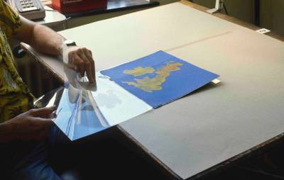
Adding an overlay to a news map 1 (1985)
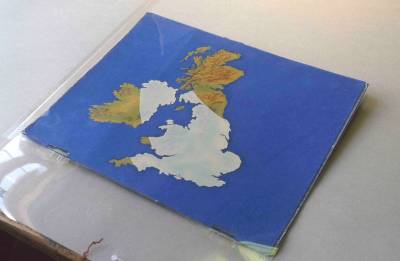
Adding an overlay to a news map 2 (1985)
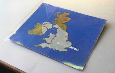
Adding an overlay to a news map 3 (1985)
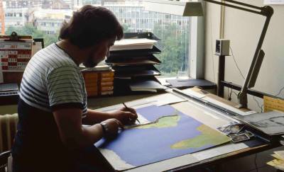
Adding Letraset to a news map 1 (1985)
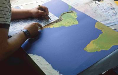
Adding Letraset to a news map 2 (1985)
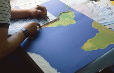
Adding Letraset to a news map 3 (1985)
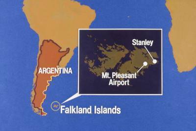
A news map on air (1985)
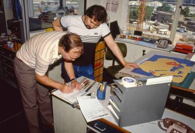
Filling out a news graphic requisition (1985)
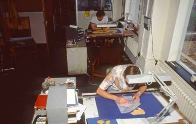
News graphic artists at work (1985)
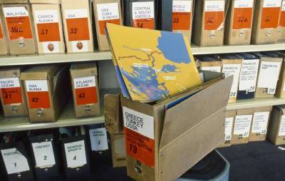
The news map library 1 (1985)
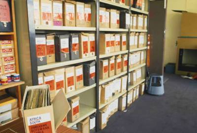
The news map library 2 (1985)
BBC News graphics in action
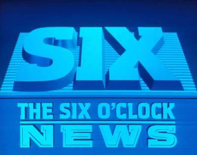
BBC Six O'Clock News logo
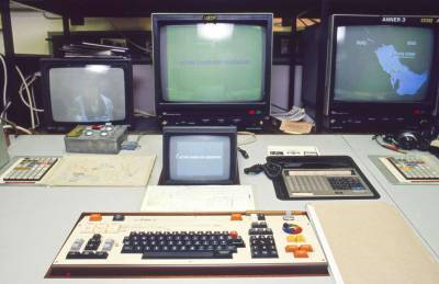
Aston 3 character generator
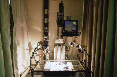
Ikegami rostrum camera
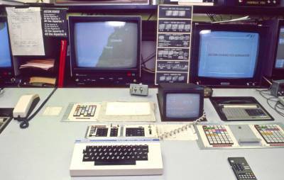
Quantel 6000 digital library system
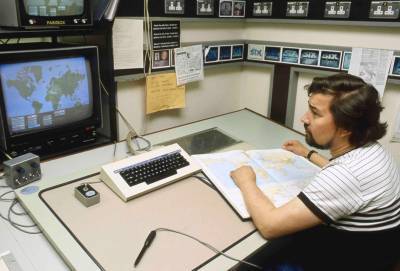
Quantel 7000 digital paintbox 1

Quantel 7000 digital paintbox 2
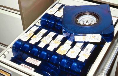
Quantel Paintbox removeable discs 1
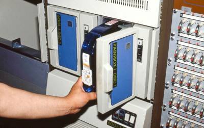
Quantel Paintbox removeable discs 2
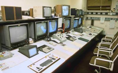
Electronic graphics workstation 1
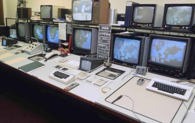
Electronic graphics workstation 2
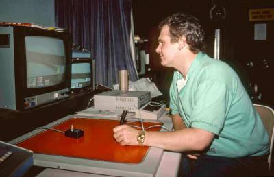
Dick Burn on Paintbox
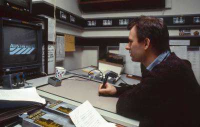
Terry Hylton on Paintbox
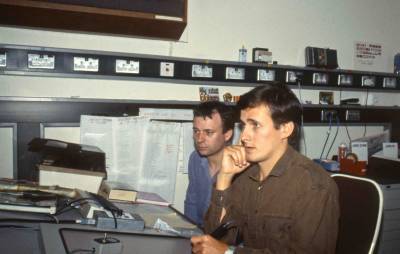
Paul D'Auria on Paintbox with Terry Hylton
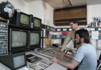
Andy Davy and assistant on Paintbox
