Concept and creative process
The 'One O’Clock News’ was the last of the main TV bulletins to undergo an ‘electronic’ redesign from the generic BBC News style that pre-dated the redesign of the ‘Six O’Clock News’. It coincided with the BBC launch of ‘Daytime TV’, a full schedule of programmes from the end of 'Breakfast Time' through to the early evening, with no schools programming (or broadcasting Ceefax pages). The design style was also to be used by short news summaries throughout the day. Another presenter was poached for the show from ITN. As this title sequence was designed for daytime transmission, the chosen look was as bright as possible and similar to the computer generated white BBC Two Channel Identity with soft shadows, that had been recently created by designer Alan Jeapes and the BBC Computer Graphics Workshop. The large model made for the title sequence was filmed on 35mm, frame by frame using a motion control camera and lit by lighting cameraman Peter Povey at Camera Effects. It was cut together on one inch tape in an all-night edit at The Moving Picture Company (all-night, as the rates were cheaper!) The concept behind the sequence was to give a sense of the hourly news summaries leading up to the main bulletin at 1pm. The in-house graphics colour palette was predominantly white and very light blue, with soft shadows cleverly generated on the Quantel Paintbox, using a 40 stage sequence (this was before 3D graphics were affordable for routine use on TV news). The title sequence and in-house graphics were all designed by Andy Davy, assisted by Marcus Picken.
More Information
BBC One O'Clock News titles shoot stills

BBC One O'Clock News titles logo

BBC One O'Clock News titles shoot stills 1
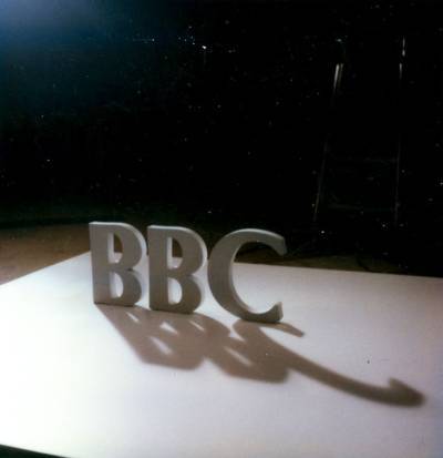
BBC One O'Clock News titles shoot stills 2
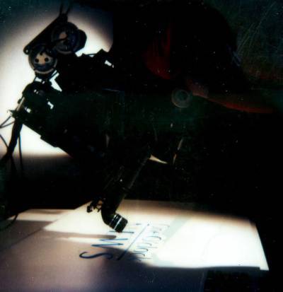
BBC One O'Clock News titles shoot stills 3
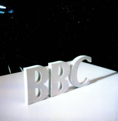
BBC One O'Clock News titles shoot stills 4
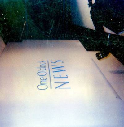
BBC One O'Clock News titles shoot stills 5
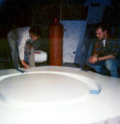
BBC One O'Clock News titles shoot stills 6
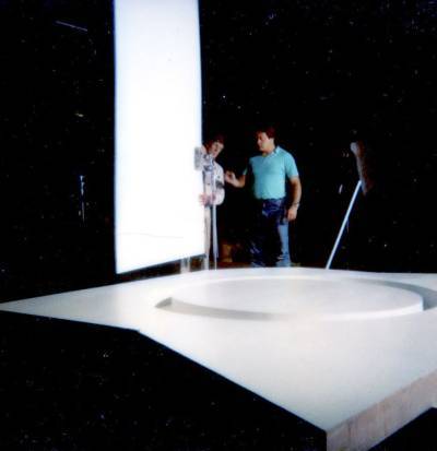
BBC One O'Clock News titles shoot stills 7
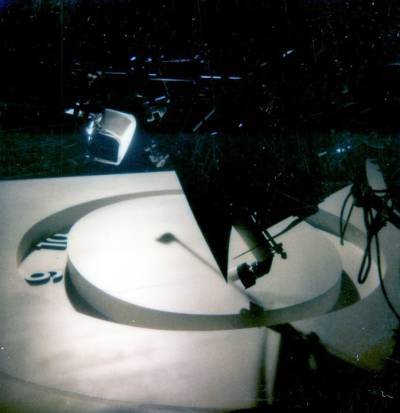
BBC One O'Clock News titles shoot stills 8
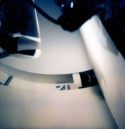
BBC One O'Clock News titles shoot stills 9
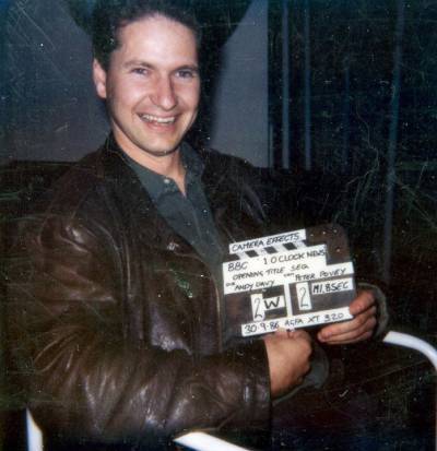
BBC One O'Clock News titles shoot stills 10 - designer Andy Davy
